22 out of 23 preservice K-8 teachers agree:
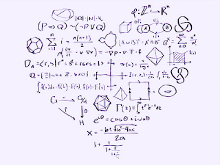
Math is Creative
They were able to tap into the arguments that people have contrarily, though. Math is about number-crunching, plug and chug, is boring, about right and wrong. I asked them to discuss at there tables how to counter those arguments, and they said:
- Everything can be mathematical - there are numbers everywhere. I think in numbers! Any lesson can tie in.
- Numbers can be manipulated in many different and unique ways.
- The basic skills are concrete, but the application is creative. Like physics: need math to describe creatively.
- The reasoning is creative. People discovered mathematics.
- The communication of math is creative. Explaining how things work.
- Creative how mathematicians come up with the formulas. Might have just discovered it accidentally.
- The different ways to represent: graphs, tables, etc.
- Math is the universal language. Everyone can communicate in it.
It was very insightful to me how they focused on the communicative aspect of mathematics. If math is a language, it may or may not be creative, much as uses of language may or may not be creative. As we share our own genuine thinking, and the way we perceive the world (or a problem), we create opportunities for creative expression.
The class moved on to look at how they communicated their work on a problem of making quadrilaterals by folding a square (an extension of this nice 3rd grade problem filmed by Annenberg - Teaching Math, Lesson 20). And immediately focused on what the answer was and were they right. After our years of school mathematics, we have definitely been well trained.
In the second workshop, we considered the quadrilateral types, and in particular the idea of nested categories or hierarchical sorting. I show this weird little travelogue:
(I want to update it and maybe make that into an animoto, but the ppt file is corrupted, so it will be more work than I have time for right now.)
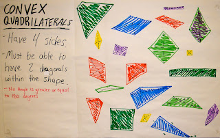
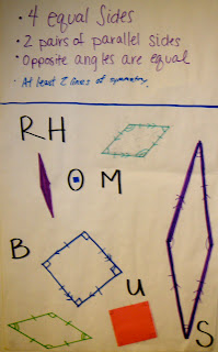
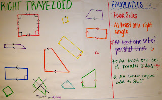
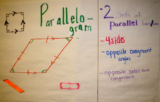
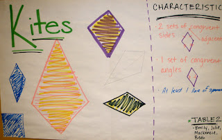
The students then made posters of some of the quadrilateral types, striving for a variety of examples, and to be creative in making the posters. Critique and discussion of the posters brought out the discussion points I was hoping for, like which properties are necessary, considering symmetry as an important characteristic, and whether trapezoids should have exactly or at least one pair of parallel sides.
Trying to make space for creativity is not going to be a one lesson effort, but hopefully a theme for the whole semester. I can't wait to see what happens.
EDIT: updated the slideshow to have more visual cues and a couple extension slides. I wanted there to be more to notice.
EDIT2: added student posters for the quadrilaterals. We worked on generating a variety of examples. Some made only the specific types, but some made a variety of types that fit the required properties. I like having both kinds of posters!



No comments:
Post a Comment