Nothing revolutionary here. Just what turned out to be a nice sequence of experiences with a group of preservice elementary teachers. No handouts, just a story and pictures of what happened.
Previously... we measured some distances, from a whiteboard marker to an outdoor commons. We discussed technique and accuracy, and I shared a bit on with what elementary students struggle. They went off and measured, and then we shared data in a Google doc. (New to some, somehow.) Choice 1 we agreed on as a class. Choice 2 was up to their group. Distance to the bathroom, trash bins, and one group was obsessed with how do they measure a bus. Then we talked about how do we go from all those different numbers to a specific measurement. How tall is a desk? We want a single number! Of course, they first go to the average.
I always push on that. One, because you need to justify, man! Always. The other because the mean is so inappropriate for low sample size because of the power of outliers.
Then last class was a day to explore measures of central tendency. I love human statistical displays and it was a gorgeous day. (October in Michigan.)
First sort: height.
They naturally lined up this way. We found the median height, with some good discussion about 19 students, which was the middle and what if it was between two people. When the middle height person stepped forward, we talked about if she was a good representation of the typical height of student in our class. People were a little uncomfortable about that. Especially at the tall end of the line.
Second sort: age.
First take, they lined up like they did for height. We found the median and discussed how well she represented typical. People were curious about the twins, who were gracious to answer age questions. I asked if it was true that boys tended to be older than girls, which led to a comparison of the significance of their position in the height chart vs their position in the age chart.
Then I asked them to line up spaced for their age. Start at 19, each sidewalk section was 4 months. "What if we're the same?" "Just line up." "Oh, it's a line plot!" Students sorted themselves within a month by age. So when we determined the median, we talked about whether to count from the front or back of that month's line. They thought that this showed the data much better because of the gaps, and were surprised how old it made that ancient 22 year old look.
Third sort: name length.
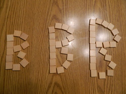
Finally split up the twins! For this one, we added unifix cubes. They made a stack of cubes the height of their name, first and last as it is on their birth certificate, and used that for comparison. The new question - could we use the cubes to figure out the mean? Would the mean be higher or lower than the median? "We could lay them all down in a big line and divide it by 19!" (Literal adaption of the arithmetic rule is pretty typical.) "What does that do?" "Could we all just share to have the same?" "We have these left over... what do we do with them?" Then we discussed if that meant the mean was closer to 13 or 14. Why was it higher than the median?
Fourth sort: shoe size.
I gave them the option of what to sort, but they were too shy to say anything. When I say shoe size, they jumped at it, and several said they were thinking about that. I like the ambiguity between men and women's, and the apparent diversity from shoe size not varying perfectly with height. I wanted to use the cubes again, but how do we do that with half sizes? Two cubes for each half size... that works! This time they sorted themselves into a line plot without being asked, working out their own spacing.
Again the mean was higher than the median. Will that always happen? How would it be different if we added 4 cubes to the men's shoes?
Starbursts
As they came back inside, I distributed Starbursts, very unfairly. Enter your data on the board before you sit down. DON'T EAT THEM YET. (Only one person did. Not bad.)

We discussed the challenges of using candy in class. Sugar, red dye, communicated values. (Why are prunes the only individually wrapped healthy snack?)
I asked them to make a line plot and pie chart of this data. The group that shared had a very nice way to make their pie chart:take the 80 starbursts, and think about 20 per quarter. Then half that is 10, half that is 5. "But there's 81?" someone asked. The class agreed that this wouldn't change the pie chart much.
Next was the hard discussion. If we want to be fair, how many should each person get? 2, since that's what most people got? But if people contributed, then there would be enough for 3 each. Wait a second, there's enough for four for each of us. With some left over! I tried to make the connection between this idea of equal distribution and the mean. Here's where we want to take outliers into account.
(Unfortunately, I showed them a graph of US income distribution at this point. Probably should have skipped that. It is one of the reasons I think statistical education is important - we can't understand our world and society without it. What do you think?)
Finally we looked at one more way to make a pie chart.
You can see two wrappers there. We compared this to the pie chart on the board, and they said that the lines really helped and they would add them. But they agreed that the drawn chart was very close.
After that we discussed how to share them fairly. I shared that this was real problem solving. The textbook problem is 81 starbursts, 19 students, how many do each get. The real life problem includes messy things like people wanting particular colors. We did a quick check of color preferences by going to the corners of the room. One corner each for red (30%), pink (25%), orange (15%) and yellow (5%). Center of the room for no preference (25%). A few methods were suggested, then someone said we should just do rounds of taking one. People agreed and we started. They wanted to make the pie chart for each one and who am I to argue.


So it was a good data day. Statistics and sunshine, who could ask for more?
Next class: starting the
glyphs project!


